Bis Henderson
Turning a tired, confusing website into a confident digital experience.
Three specialist divisions, three kinds of buyer, and one website talking to all of them at once. We ran a strategy workshop, rebranded the group, then built eight templates their own team can run.

30%
more engagement, measured against the pre-launch baseline.
Sector
Recruitment: supply chain, logistics and procurement
Services
Strategy workshop · Rebranding · Web design and build · UX/UI design
Delivered
Workshop February 2025 · live 2025
New logo
A mark built to divide. The three diamonds aren’t decoration; they’re the three divisions, so the group and its specialisms can share one identity without competing for attention.

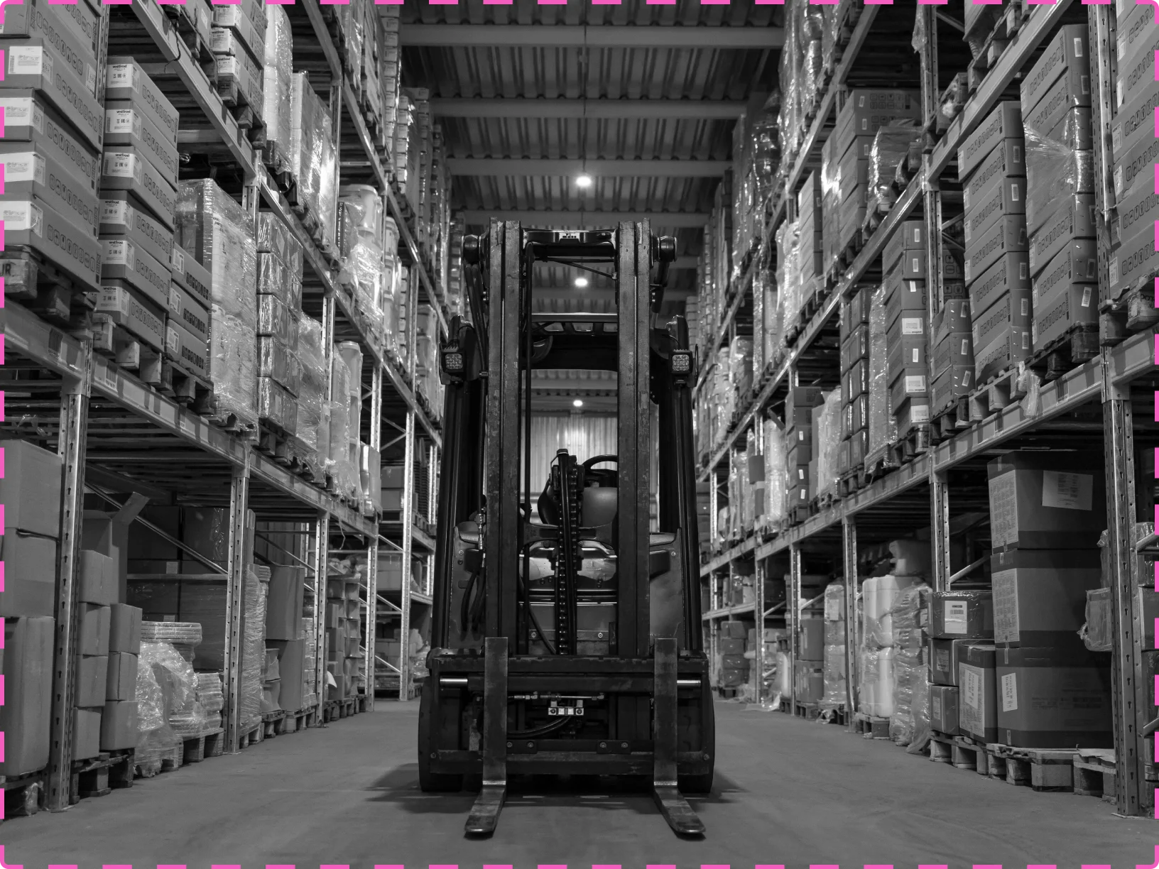
People photo
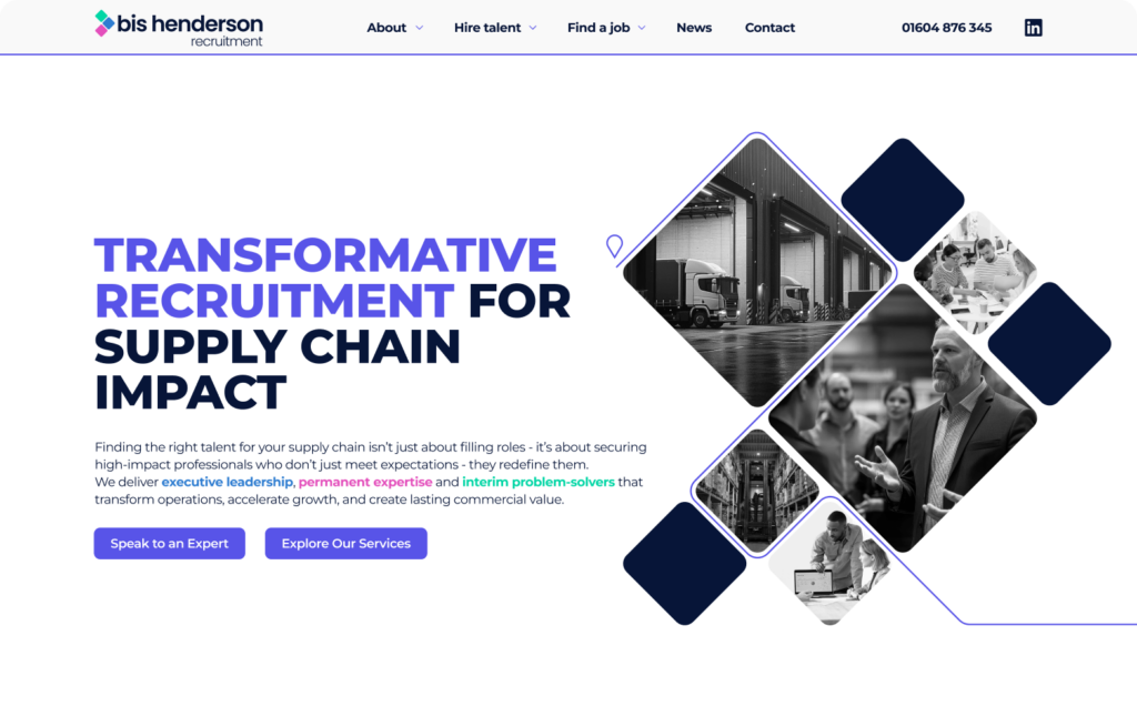
Recruitment is people, and the old site never showed one. Photography became a fixed part of the system rather than something added at the end.
The problem
One voice for nine different conversations.
Bis Henderson has been placing supply chain talent for over thirty years. The website didn’t say so. It was formal, generic, and gave no clue the business runs three specialist divisions across supply chain, logistics and procurement. An executive search client, a hiring manager filling a mid-level role and a business stuck on IR35 all landed on the same words. Rankings had slipped and enquiries with them, and nobody could point at the reason.

Route lines and pins
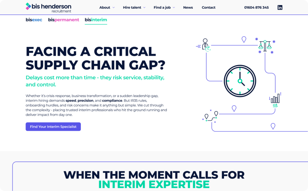
Nine pages needed nine different graphics. So we built a system instead of buying stock: route lines, map pins and industry icons that recombine endlessly and look like supply chain rather than generic business.

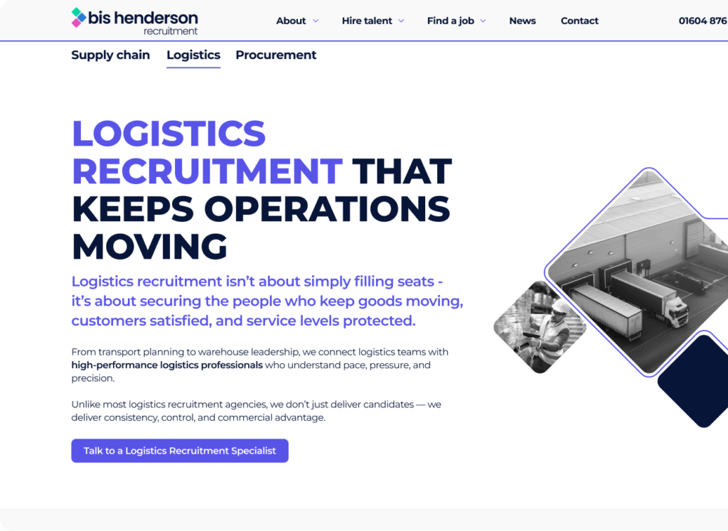
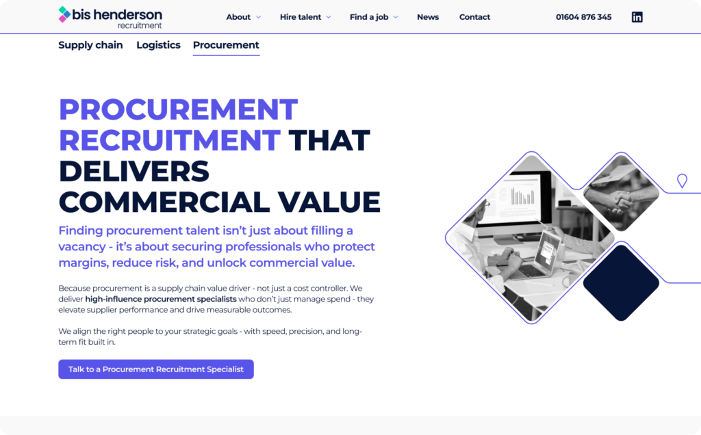
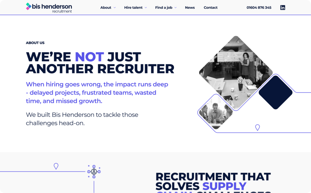
Diamond photo compositions
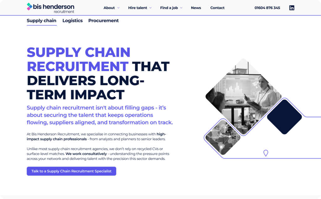
Every image sits inside the mark. It means any photo, from any shoot, instantly looks like Bis Henderson, which matters when the marketing team is adding pages without us.


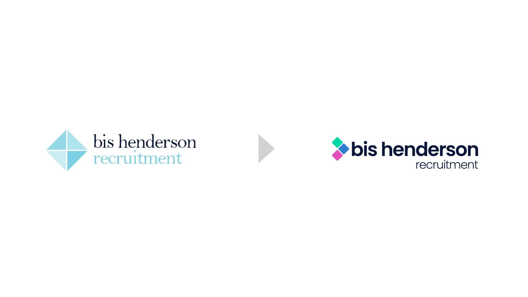
Old logo to new
They asked for modern and engaging. The refresh keeps thirty years of recognition intact and adds the structure the old mark couldn’t give them: room for three sub-brands underneath it.
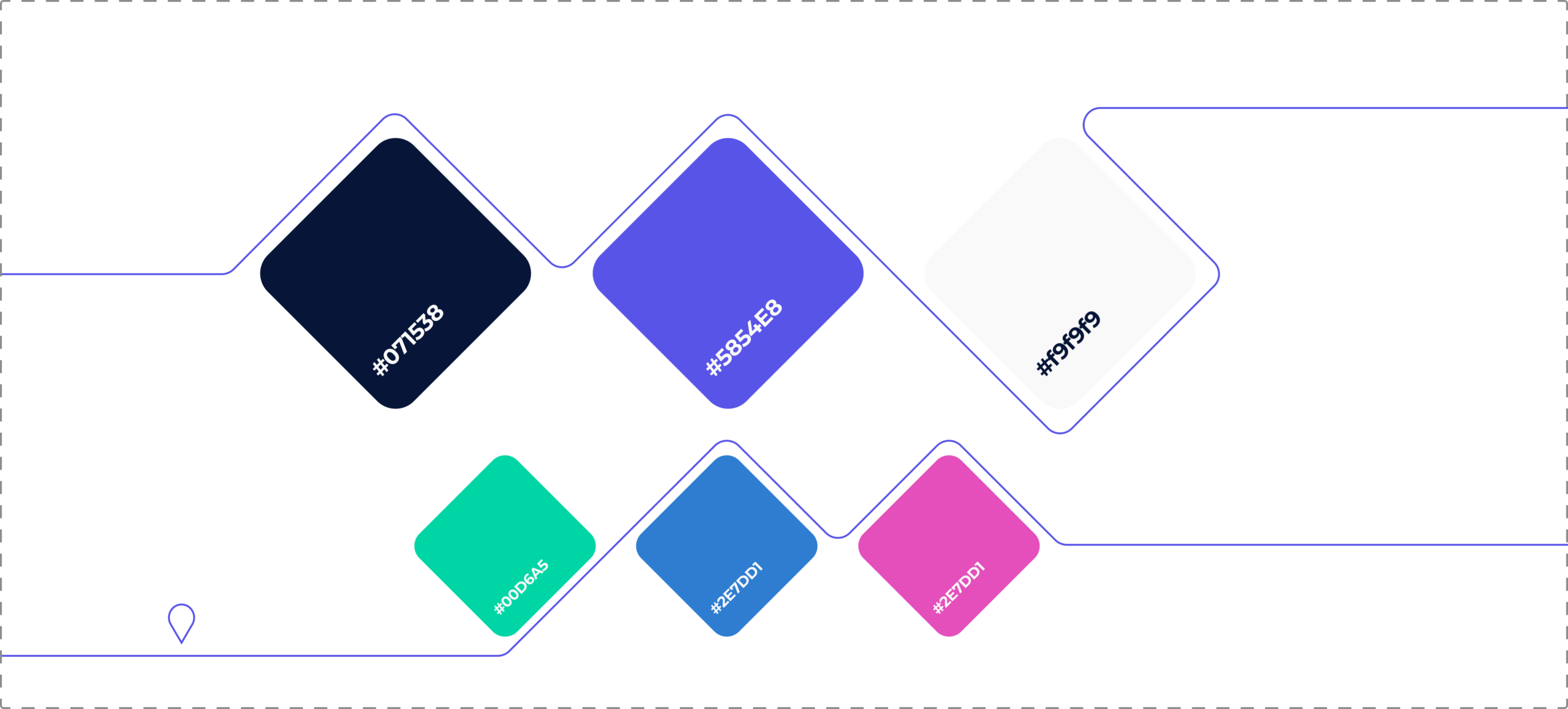
Colour palette
They wanted their two premium services differentiated. Colour does it faster than words: land anywhere on the site and the palette tells you whether you’re in Exec, Permanent or Interim before you’ve read a line.
They came for a website. We started with the brand.
Three audiences, not one.
The workshop put three columns on the wall, one per division, and asked what the buyer is actually stuck on. Executive search clients cannot get in front of the right senior people. Hiring managers cannot reach mid-management. Interim buyers do not understand IR35. Three conversations, three answers, and a website having none of them.
A brand that tells you where you are.
By the end of the workshop the identity clearly couldn’t carry one: not enough assets to tell three stories, no way to signal which division you were in. So the rebrand came first. Each division took a sub-brand and a colour (bisexec, bispermanent, bisinterim) and the asset system draws supply chain literally.
Eight templates, nine conversations.
Three divisions across three specialisms is nine reasons to get in touch. Eight page templates cover them, built as modular blocks so their marketing team can add pages without coming back to us. The IR35 note from February became the section on the Interim page that answers the objection before anyone has to take the call.
Then it went live.

The proof
Same business. Finally looks like it.
30%
more engagement, against the pre-launch baseline.
22%
more traffic, against the pre-launch baseline.
20%
lower bounce rate, against the pre-launch baseline.
Their success criteria, written on the day
“We want to achieve a modern and engaging look and feel.” Met.
“We want to showcase and differentiate our two premium services (Exec Search and Interim).” Met.
“We want the website optimised to recover our SEO rankings and inbound inquiry numbers.” Met.
Laptop photo
Ninety per cent of this lands on a screen someone is only half looking at. Every page was designed for that first glance, not for the portfolio shot.
Services used
Four services, one project.
One day
Strategy workshop
One day, their team in a room, three audiences on the wall and a direction at the end of it.
Four stages
Rebranding
For when how you look has stopped matching what you do. Strategy, messaging and identity together.
Eight templates
Web design and build
Modular blocks on WordPress, so their marketing team can add pages without coming back to us.
Nine journeys
UX/UI design
Three divisions across three specialisms is nine reasons to get in touch. Each one got a route through.
Feeling like your brand is holding you back?
When strategy moves on but the site doesn’t, growth slows and trust erodes.
Struggling to get buy-in?
Use our free calculators to work out what the project’s worth and what waiting is costing you. Then get your MD to say yes.