UI/UX Strategies to Increase Website Conversions
Leveraging First Impressions and Building Trust on your website
When a user lands on your website, a critical countdown begins, setting the stage for their initial impression. This brief yet pivotal moment can determine whether they decide to engage further or leave, never to return. The design choices you make, from colour schemes to layout symmetry, play a significant role in this initial engagement phase. By understanding and implementing strategic psychological triggers and emotional design principles, you can design web experiences that capture attention and convert visits into valuable interactions.
In the UI/UX design realm, the subtle nuances of how design elements can influence user perception are profoundly impactful. The colours, typography, imagery, and even the microcopy you choose can evoke emotions that set the tone for user interactions. When users feel a positive emotional connection right from the start, their likelihood of taking the desired actions increases significantly.
This article explores how robust UI/UX design principles, such as psychological triggers and emotional design, build trust, make powerful first impressions, and drive user conversions. We’ll delve into how these design strategies can be applied effectively to engage users, enhance their journey through your site, and ultimately contribute to your site’s success. By the end, you’ll understand why good design is not just about aesthetics—it’s a critical component of successful digital marketing strategies that aim to maximise user engagement and boost conversion rates.
Psychological Triggers in UI/UX Design
Understanding and applying psychological triggers is critical to designing experiences that engage users and drive them to conversion. By leveraging principles from emotional design and behavioural psychology, designers can create interfaces that subtly influence user behaviour and decision-making processes. This approach enhances the user experience and significantly boosts conversion rates.
Emotional Design
Emotional design focuses on creating products that elicit positive feelings from users, thereby increasing their likelihood of taking desired actions. Emotions play a crucial role in decision-making; a user who feels good about an interaction is likelier to convert. Critical aspects of emotional design include:
Colour Psychology: Colours can evoke specific emotions and influence perceptions. For instance, blue can induce feelings of trust and security, often used by banks and insurance companies. Red, known for its ability to create urgency, can effectively be used for ‘Buy Now’ buttons, as it draws attention and can spur on-the-spot purchasing decisions. Meanwhile, green is associated with peace and growth, often seen in health and environmental contexts to promote wellbeing.
Typography and Microcopy: The choice of fonts and the language used in microcopy can also greatly influence how users feel about a product or service. Serif fonts, for example, are viewed as formal and trustworthy, while sans-serif fonts are seen as modern and approachable. Similarly, microcopy that includes friendly and reassuring language can make users feel more comfortable and supported, increasing the likelihood of engagement and conversion.
Imagery and Themes: Images can stir emotions that text alone might not convey. High-quality, relatable images can create a sense of professionalism and appeal. At the same time, thematic elements consistent with the brand can foster familiarity and affinity.


Behavioural Psychology
Behavioural psychology in UI/UX design utilises human tendencies and behaviours to persuade users toward conversion. Some common psychological principles used in design include:
Scarcity: The principle of scarcity is based on the idea that people are more likely to desire something that is in limited supply. Implementing elements like countdown timers or displaying limited stock levels can create a sense of urgency that compels users to act quickly. For example, an e-commerce site might show messages like “Only 3 left in stock!” next to product listings to encourage immediate purchases.
Social Proof: Human beings tend to follow the actions of others; this is where social proof comes into play. Including user testimonials, reviews, and social shares can reassure potential customers of the product’s value and quality. For instance, a product page with many positive reviews and “As seen on” media badges can significantly enhance trust and credibility, prompting more users to convert.
Reciprocity: This principle suggests that people feel obliged to give back to others who have given to them. In the UI/UX design context, offering something for free—like a trial, a sample, a free download, or valuable content—can make users more inclined to return the favour by purchasing a subscription. A software company might offer a 30-day free trial, after which the user may feel more compelled to subscribe because of the value they received during the trial.
Commitment and Consistency: Users are more likely to follow through once they commit to something. This can be leveraged by getting users to agree to small initial requests, such as signing up for a newsletter or creating an account, which can later lead to more extensive commitments like purchasing.
Companies can create more compelling and persuasive digital environments by carefully integrating these psychological principles into the UI/UX design. Emotional design and behavioural psychology are not just about manipulating feelings or actions; they’re about creating experiences that genuinely resonate with users, making the interaction memorable and satisfying. This strategic approach not only improves user satisfaction but also drives conversions, ultimately contributing to the success and growth of the business.
User-Friendly Navigation and Flow
Effective navigation is the backbone of any successful website. It guides users through a digital environment, enhancing their experience and increasing the likelihood of conversion. A straightforward, intuitive navigation setup ensures that users find what they need without frustration or confusion, crucial for maintaining engagement and satisfaction. This section delves into the essential components of user-friendly navigation, including user journey maps and best practices in navigation design.


User Journey Maps
User journey maps are visual representations of the user’s pathway through a website, from initial contact through various stages of engagement up to conversion. These maps are crucial in understanding users’ typical interactions with your site, identifying potential pain points, and optimising the flow to enhance usability. For instance, a user journey map might illustrate how a visitor goes from a landing page to a service page, resource download, and a contact form conversion. This tool helps designers and developers visualise the decision-making process from the user’s perspective, ensuring that all navigational elements are aligned with user expectations and business goals.
Effective user journey maps should outline the following:
- Entry points: Where users are likely to first interact with your site.
- Touchpoints: Key interactions with the site, such as menu selections, button clicks, and form entries.
- Decision points: Locations where users decide whether to continue engaging or leave.
- Endpoints: Conversion or exit points from the site.
Best Practices for Navigation Design
When designing navigation, several dos and don’ts can help streamline the user experience and facilitate smoother interactions. Here are some essential guidelines:
Do:
- Keep it Consistent: Ensure your navigation design is consistent across all pages. Consistency reduces the learning curve and helps users develop intuition about interacting with your site.
- Use Familiar Patterns: Stick to navigation patterns that users are already accustomed to, like placing the main menu at the top or sidebar. This familiarity makes navigation more intuitive.
- Prioritise Clarity: Use clear, descriptive labels for navigation links to avoid ambiguity. This clarity helps users find what they need faster.
Don’t:
- Overcomplicate: Avoid cluttering your navigation with too many options. More choices can lead to decision fatigue, making the site easier to use.
- Hide Important Elements: Essential navigation links should be visible in menus or dropdowns where they might be noticed. Visibility is vital to ensuring users can navigate your site without difficulty.
- Neglect Mobile Users: Ensure your navigation design is responsive and accessible on mobile devices. Mobile users should be able to navigate your site just as easily as desktop users.
Examples from Successful Brands


Amazon’s navigation system exemplifies precise categorisation and easy accessibility, allowing users to rapidly narrow their search. Google’s clean and straightforward navigation in its apps, focusing on minimalistic design and clear icons, also showcases best practices in creating a user-friendly interface that facilitates quick user orientation and task completion.
In conclusion, designing an effective navigation system involves understanding the user’s journey, applying established design practices, and continuously testing and refining the system based on user feedback and behaviour. By prioritising user-friendly navigation and flow, you enhance user experience and significantly boost your site’s conversion potential.
Impact of Mobile Responsiveness on Conversions
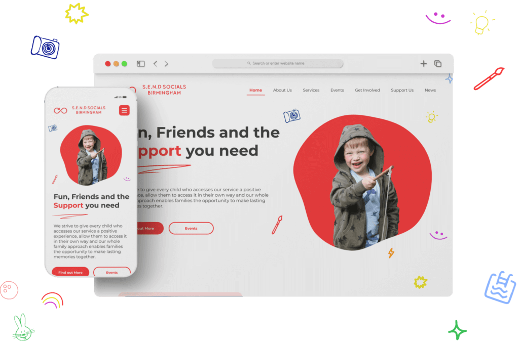
Mobile responsiveness has become a non-negotiable aspect of web design, particularly given the increasing prevalence of smartphones for internet browsing and shopping. Understanding the impact of mobile responsiveness on user behaviour and conversion rates is crucial for any business aiming to maximise its digital potential.
Statistics and Trends
Recent statistics highlight the critical role of mobile devices in online interactions:
- Mobile Dominance: As of 2023, over 54% of global internet traffic comes from mobile devices, indicating a shift away from traditional desktop browsing (Source: Statista).
- Conversion Rates: Mobile devices account for approximately 40% of all online transactions, with mobile commerce growth outpacing desktop-based sales (Source: Adobe Analytics).
- User Behavior: Google reports that 61% of users are unlikely to return to a mobile site they needed help accessing and 40% visit a competitor’s site instead.
These statistics underscore the necessity of mobile optimisation for user retention and conversion rates. Sites optimised for mobile devices see an average increase in sales conversion rates of up to 15% compared to those that are not, emphasising how mobile responsiveness directly influences purchasing decisions.
Responsive Design Techniques
To ensure a website is effectively optimised for mobile use, implementing the following responsive design techniques and frameworks is essential:
- Mobile-First Design: This approach involves designing for the smallest screen first and then scaling up. It prioritises the performance and layout of the mobile environment, ensuring that mobile users experience the most functional version of the site. This technique helps reduce load times and improves the user experience for mobile visitors.
- Flexible Grids and Layouts: Using flexible grids that adapt to the screen size helps create a seamless user experience across devices. Elements within a flexible grid context automatically resize according to screen dimensions, maintaining layout integrity and visual coherence.
- Optimised Images and Asset Flexibility: Ensure images and other media content are optimised for fast loading on mobile devices. Adaptive images that adjust according to screen size can significantly improve load times and reduce data usage for mobile users.
- Touchscreen Considerations: Design for touchscreen navigation with appropriate target sizes for buttons and links. The average adult finger pad size is about 10mm wide, so interactive elements should be at least that wide and spaced adequately to prevent mis-taps.
By implementing these responsive design techniques, businesses can ensure their websites provide mobile users a positive, engaging experience. This enhances usability and significantly impacts conversion rates by making the path to purchase as smooth and straightforward as possible. In today’s mobile-centric world, responsive design is not just a technical requirement—it’s a strategic business imperative that directly contributes to a website’s success in converting visitors into customers.
Comprehensive Look at CTA Design
A Call to Action (CTA) design is pivotal in guiding users towards conversion, whether signing up, purchasing, or downloading. A well-crafted CTA catches the eye and compels action, making it one of the most significant components of any web page. In this section, we’ll delve into the design variants of effective CTAs and the conversion metrics that help measure their success.
Design Variants of Effective CTAs
1. Color and Contrast: One fundamental element of a successful CTA is its ability to stand out through colour. For instance, a bright orange button on a dark blue background instantly draws attention. The key here is contrast; the more significant the distinction between the CTA and its surroundings, the more it will pop. Amazon’s ‘Add to Cart’ button is a classic example, using bright orange to draw users’ eyes directly to the purchase option.
2. Size and Shape: The size of a CTA can influence user interaction. A more prominent button can signify its importance but may overwhelm other content if it is too large. The shape also plays a role; rounded edges are often perceived as friendlier and more clickable than sharp, angular ones. Apple’s CTAs usually feature soft, rounded edges that match the company’s overall aesthetic and brand identity.
3. Text and Urgency: The wording used in CTAs can directly affect their effectiveness. Verbs like ‘Get’, ‘Start’, ‘Join’, and ‘Learn’ coupled with urgency-inducing phrases like ‘Now’ or ‘Today’ can create a sense of necessity. Netflix uses this strategy effectively with CTAs like “Join Free for a Month”, which suggests a benefit and a time-limited offer.
4. Placement and Spacing: Placement is crucial for visibility. A CTA should be placed high on the page and in the central column of the layout. Additionally, ensuring enough white space around the CTA can reduce distraction and focus the user’s attention.

Conversion Metrics for CTA Design
To measure the effectiveness of different CTA designs, specific metrics are utilised:
1. Click-through Rate (CTR): This is the percentage of visitors who click on the CTA after viewing it. A higher CTR indicates a more effective design.
2. Conversion Rate: This metric measures the percentage of users who click on a CTA and then complete the desired action, such as purchasing or signing up. It directly relates to the effectiveness of the CTA and the landing page it directs to.
3. Bounce Rate on CTA Pages: The bounce rate on pages with CTAs can indicate if the CTA is misaligned with visitor expectations. Suppose a high percentage of visitors leave without clicking the CTA. Either the CTA or the page content needs to be re-evaluated in that case.
4. A/B Testing Results: Testing different versions of a CTA can reveal which elements — colour, text, size, or placement — perform best. For instance, changing the text from “Buy Now” to “Get Yours Today” might increase conversion rates, suggesting a more effective phrasing.
Through thoughtful design and careful measurement, CTAs can be optimised to draw attention and drive users to take action. By continuously testing and refining these elements based on user feedback and performance metrics, marketers can significantly enhance the effectiveness of their digital strategies.
Accessibility and Inclusive Design in UI/UX
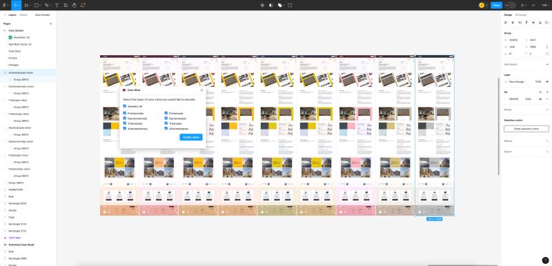
In the digital landscape, accessibility and inclusive design are ethical responsibilities and strategic business practices that can significantly enhance user engagement and conversion rates. By adhering to global accessibility standards and integrating thoughtful design features, businesses can ensure their digital content is usable and enjoyable for all users, including those with disabilities. This commitment broadens the audience reach and improves the overall user experience, leading to higher conversion rates.
The Importance of Global Accessibility Standards
Global accessibility standards, such as the Web Content Accessibility Guidelines (WCAG), set forth by the World Wide Web Consortium (W3C), provide a framework for creating web content that’s accessible to people with a wide range of disabilities—including auditory, cognitive, neurological, physical, speech, and visual impairments. Following these standards is crucial for several reasons:
Enhanced User Experience: Accessible design improves the user experience for everyone, not just those with disabilities. For example, captioning videos not only assists deaf users but also aids understanding in noisy environments or situations where audio cannot be played.
Broader Market Reach: Approximately 15% of the world’s population lives with some form of disability. By designing accessible websites, businesses can tap into this significant market segment, potentially increasing their customer base and conversion rates.
SEO Benefits: Many accessibility practices, such as providing alternative text for images and ensuring proper heading structures, align with search engine optimisation (SEO) best practices. This can enhance a site’s visibility and ranking in search engines.
Accessibility Features That Boost Conversion
Implementing specific accessibility features can directly impact the effectiveness of a website by making it more navigable, understandable, and operable for all users. Here are some key features that aid in conversion:
Text-to-Speech: Text-to-speech technology allows content to be consumed audibly, which is crucial for users with visual impairments or reading disabilities. This feature can be handy for long-form content, e-commerce product descriptions, and complex information, ensuring all users can easily access the content.
Alternative Text for Images: Providing alt text for images is fundamental to web accessibility. The alt text describes the appearance and function of an image on a page, allowing screen reader users to receive the information conveyed by the pictures. This is particularly important for e-commerce sites where product imagery is central to purchasing decisions.
Keyboard Navigability: Many users with physical disabilities rely on a keyboard rather than a mouse to navigate websites. Ensuring that all interactive elements, including forms, links, and media controls, are accessible via keyboard is essential. This includes providing visible focus indicators so users can easily see which element has the keyboard focus.
Accessible Forms: Forms are often a crucial part of the conversion process, whether for signing up for newsletters, registering for accounts, or completing purchases. Making forms accessible involves labelling each field clearly, providing error messages that are easy to understand, and ensuring that all form controls are accessible to screen readers.
Consistent Navigation: Consistent and predictable navigation is crucial for users with cognitive disabilities. Keeping interactive elements consistent across pages and providing clear indications of the current location within the website can help reduce confusion and improve ease of use.

The Role of AI in Personalizing User Experience
In the digital age, artificial intelligence (AI) revolutionises how businesses interact with customers by offering highly personalised user experiences. AI’s ability to analyse data and predict user behaviour has made it an indispensable tool in enhancing engagement and conversion rates on digital platforms. By delivering dynamic content and tailored experiences, AI can significantly increase the relevance and effectiveness of digital interactions.
Dynamic Content: Tailoring Experiences with AI
Dynamic content is web content that changes based on the user’s behaviours, preferences, and interests. AI powers this dynamic adjustment by analysing data from user interactions, such as visited pages, products viewed, or search history, and presenting content most likely to appeal to the user.
Real-Time Adaptation:
AI excels in its ability to adapt the content in real-time. For instance, as a user interacts with a website, AI algorithms can immediately adjust the content displayed, from changing the images and banners to modifying the page layout to better suit the user’s preferences. This instant adaptation improves user engagement. It enhances conversion chances by making the content more relevant to the user’s immediate needs.
Predictive Personalisation:
Using machine learning, AI can predict a user’s future behaviour based on past actions. This predictive capability allows businesses to serve personalised recommendations and offers before the user explicitly expresses need or desire. For example, an e-commerce site might use AI to analyse a user’s browsing history and past purchases to suggest similar products or accessories, a method proven to increase upselling and cross-selling opportunities.
Success Stories in AI for Personalisation
Several well-known companies have leveraged AI-driven personalisation to boost conversion rates and strengthen customer loyalty. Here are a few illustrative examples:
Amazon’s Recommendation Engine:
Amazon uses AI to power its recommendation engine, which suggests products based on the user’s past shopping behaviour, items in their cart, and what other customers have viewed and purchased. This personalised recommendation system accounts for a significant portion of Amazon’s sales, with tailored suggestions making it easier for users to find products they are likely to buy.
Netflix’s Viewing Suggestions:
Netflix employs sophisticated AI algorithms to personalise viewing recommendations for each user. By analysing data from what a user has watched and enjoyed in the past, Netflix can suggest new shows and movies that are likely to be interesting. This enhances user satisfaction and keeps subscribers engaged with the platform, reducing churn rates.
Spotify’s Discover Weekly:
Spotify uses AI to create its popular ‘Discover Weekly’ playlist, a collection of songs tailored to each listener’s tastes. This feature analyses listening habits, favourite genres, and even similar user preferences to introduce listeners to new music every week. This personalised approach has dramatically increased user engagement and premium subscriptions.
The Impact of AI on User Experience
The deployment of AI in personalising user experience holds several significant benefits:
- Increased Engagement: Personalised experiences are more engaging because they relate to users’ interests and needs. AI’s ability to deliver these personalised interactions in real time further enhances engagement.
- Higher Conversion Rates: AI-driven personalisation can lead to higher conversion rates by making relevant suggestions and improving the user experience. Users are more likely to purchase if presented with options that align closely with their preferences.
- Enhanced Customer Loyalty: Personalisation helps build emotional connections with users. Users who feel that a platform understands their needs and preferences are likelier to return and recommend it to others.
In conclusion, AI’s role in personalising user experiences is transformative. It allows businesses to tailor their digital platforms to users’ needs, fostering a more engaging, satisfying, and fruitful interaction. As AI technology evolves, its integration into user experience strategies will become more refined, enhancing the ability to deliver meaningful and personalised content to users.


Integrating Voice User Interface (VUI) into Web Design
The advent of Voice User Interface (VUI) technology is redefining user interactions on the web, making it essential for UI/UX designers to incorporate voice functionality into their digital platforms. As voice recognition technology becomes more sophisticated and user-friendly, its integration into web design is not just a trend but a strategic enhancement that can significantly boost user engagement and conversion rates.
Future Trends in Voice User Interface
Broad Adoption of Voice Search:
Voice search is rapidly gaining popularity, with significant implications for SEO and web design. As more users turn to voice commands for browsing and shopping, websites are being optimised for voice search to improve accessibility and enhance user experience. This trend is driven by the ease of use and speed of voice interactions, encouraging web designers to integrate voice search functionalities directly into their interfaces.
Voice-First Design:
Emerging as a key trend, voice-first design focuses on creating web experiences that can be navigated primarily through voice commands. This approach efficiently makes websites accessible to visually impaired users or those seeking a hands-free browsing experience. It involves designing auditory and verbal interactions that are as intuitive and comprehensive as visual interfaces.
Enhancing Personalisation Through Voice:
VUI enables highly personalised interactions based on user voice input, allowing websites to deliver customised content and recommendations. This level of personalisation can significantly enhance the user experience, leading to increased customer satisfaction and loyalty.
Practical Applications of VUI in Web Design
Voice-Enabled E-Commerce:
Online retailers are increasingly implementing VUI to make shopping more convenient and accessible. For example, websites with voice search capabilities allow users to find products quickly by simply speaking into their devices. This functionality can significantly enhance the user experience, reduce search time, and increase conversion rates by streamlining the path to purchase.
Interactive Customer Service:
Integrating VUI into website customer service can improve user satisfaction by providing immediate responses and support. Voice-enabled customer support can guide users through troubleshooting steps, answer FAQs, and connect them with human representatives, all through conversational interfaces.
Accessibility Enhancements:
Incorporating VUI into web design is crucial in making websites accessible to everyone, including those with disabilities. Voice navigation aids users with visual impairments or mobility issues, allowing them to interact with the site through voice commands and receive auditory feedback, which is essential for inclusive design.
Impact of VUI on Web Conversions
The direct impact of VUI on web conversions lies in its ability to streamline interactions and make web navigation more intuitive:
- Reduced Friction: Voice commands can simplify actions like searching, filling out forms, and completing purchases, thereby minimising user effort and reducing friction throughout the conversion process.
- Enhanced Engagement: Voice interactions can make the web experience more engaging and personalised, which increases user retention and encourages repeat visits.
- Increased Accessibility: By making websites more accessible through voice technology, businesses can reach a wider audience, including those who may have been excluded due to disabilities, thereby expanding their customer base and potential conversions.
In conclusion, integrating VUI into web design is not just about keeping up with technology trends; it’s about enhancing the functionality, accessibility, and user-friendliness of websites. As voice technology continues to evolve, its incorporation into web design will become increasingly important, offering new ways to attract, engage, and convert users in the digital landscape.
Enhancing Web Conversions Through Advanced UX Design
As we delve into the transformative role of UX design in improving web conversions, it becomes evident that the strategic integration of advanced design principles and emerging technologies is critical to crafting successful digital experiences. From leveraging AI for personalised interactions to incorporating Voice User Interfaces for seamless navigation, each element of advanced UX design plays a critical role in attracting and retaining users.
The deployment of AI in UX design allows for real-time personalisation of content, directly impacting user engagement by providing a tailored experience that meets individual needs and preferences. This level of personalisation enhances the user experience and significantly boosts conversion rates by making interactions more relevant and engaging.
Voice User Interfaces (VUI) represent another innovative facet of UX design, offering users an alternative and often more accessible way to interact with digital platforms. By enabling voice commands and responses, VUIs make websites more navigable for all users, including those with disabilities, thus expanding a site’s accessibility and usability. This inclusivity aligns with ethical design principles and widens a brand’s audience reach, potentially increasing user engagement and conversions.
Furthermore, the core principles of UX design, like intuitive navigation, coherent content structure, and responsive design, remain fundamental in ensuring that websites are user-friendly and effective at converting visitors into customers. Effective navigation systems guide users effortlessly through a site, enhancing their experience and likelihood of conversion. Meanwhile, responsive design ensures that this experience is consistent across all devices, further increasing the accessibility and effectiveness of a website.
