Maybe I take my role as a designer a little too seriously but when I am surrounded my marketing material I cant help but analyse it. If I dont like it why dont I? What is it about their colour scheme that I like?
Let me put it into context…Yesterday I went to the ‘Fresh Business Thinking’ conference and thumbs up to them because it was really informative and I came home buzzing with ideas. There were several stands and whilst most were not relevant to me I enjoyed examing their marketing material. In all honesty some were very bad, some were very plain but three in particular stood out. They grabbed my attention and because I am a graphic designer I initially judge a company by their brand and design. If they’re marketing material is aestically pleasing I am more likely to trust them. That’s my opinion, what do you make your judgements on?
The three brochures that impressed me the most are below:
The top three companies are as follows:
All about brands

I have put this company first because their brochure impressed me the most. I get drawn in by pretty pictures and so this one gets gold! Obviously this is my opinion someone else might hate it. If you do please tell me why.
This brochure contained rich imagery on every page that was unique and relevant to the title.
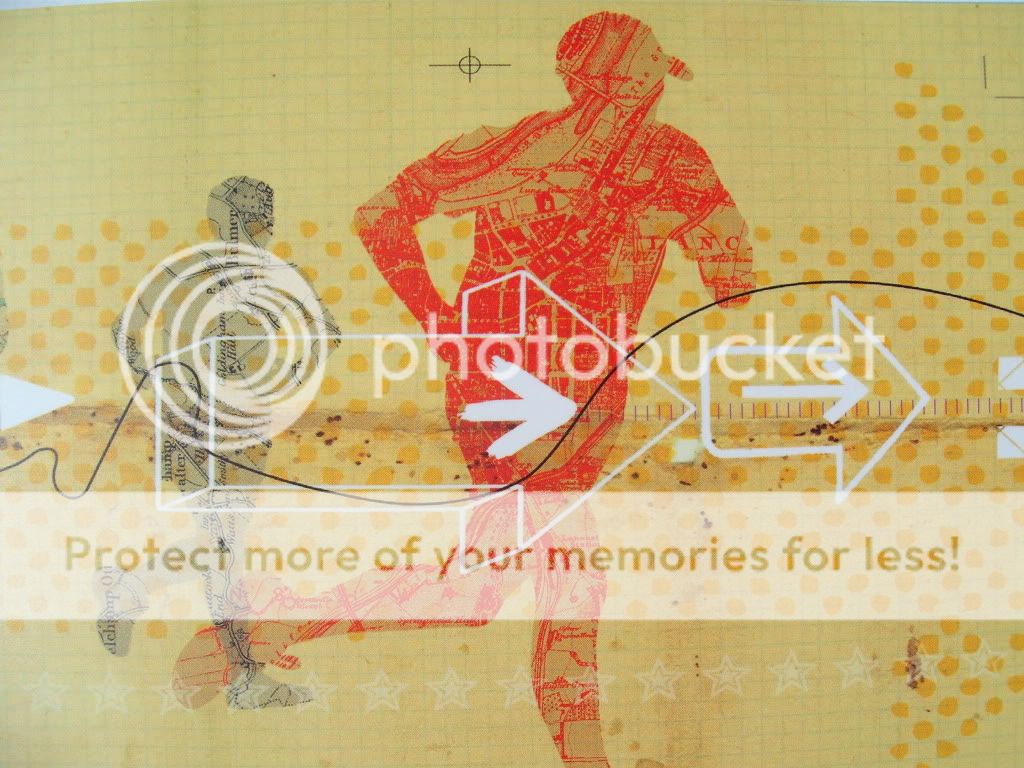
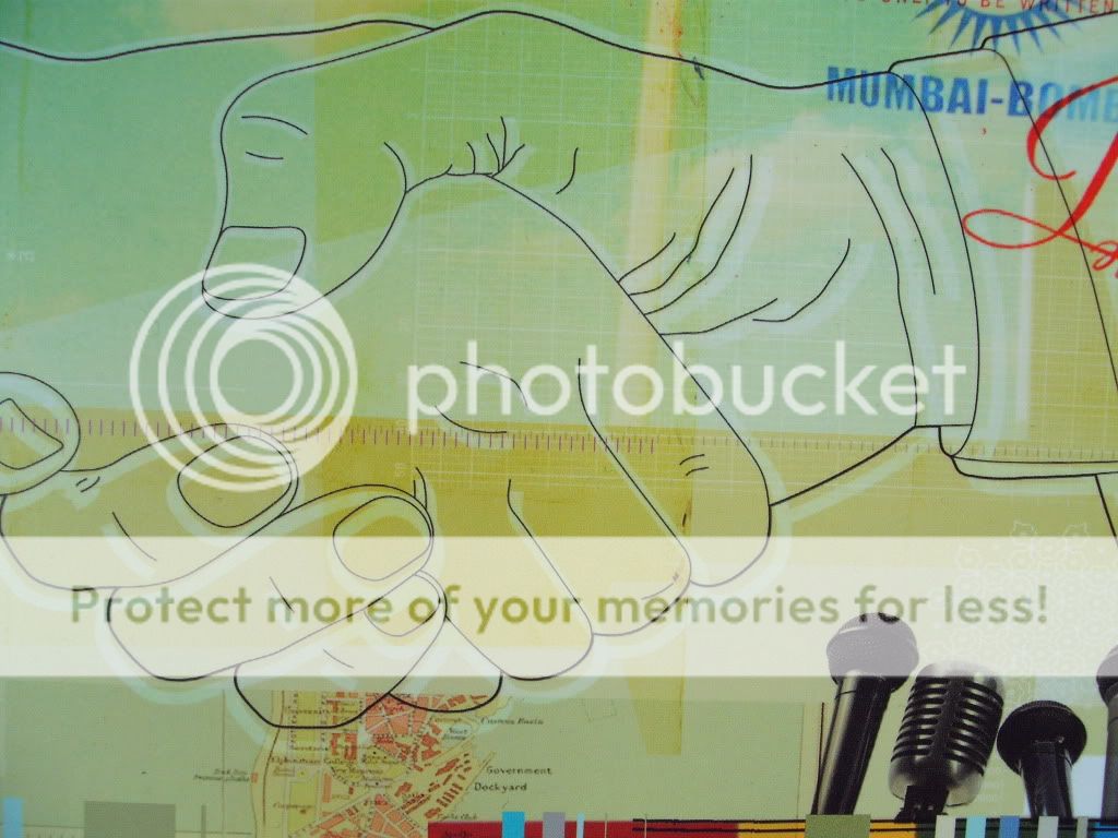

Graphic images were layered on top of textured patterns which gave the page more depth and the composition told the veiwer a story. I think this is a very important point – pictures tell a story. This information can be read by the veiwer instantly. Once you have gained their attention they then go on to read further.
Outsourcery

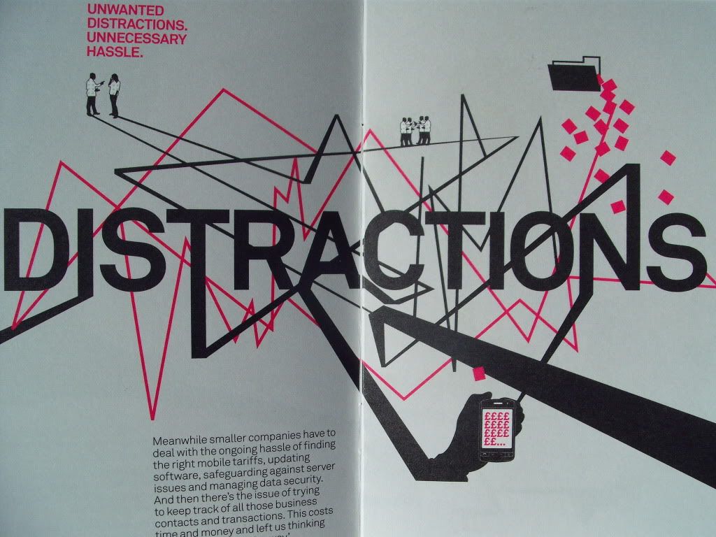
This brochure caught my attention because of it’s strong black and bright pink presence. Also the middle page opens out which offers readers further interaction and sets it apart from your standard A6 brochures.
Viadeo

The third brochure is very clever. The company specialise in platform integration (iphone apps to you and me) but it’s choice of front cover design was already burried in my mind.
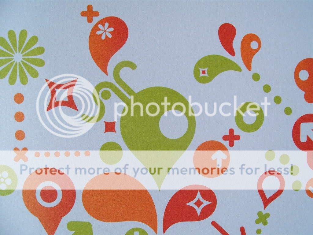
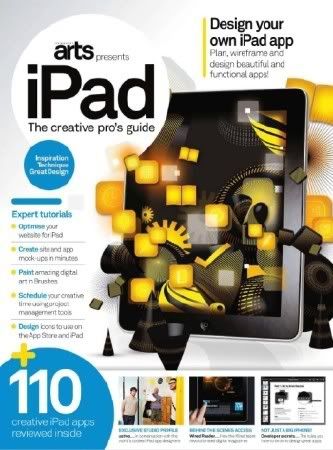
I picked this brochure up because the colours and bold graphic design caught my attention. When I got home I realised I had seen something similar the previous day whilst researching my article about graphic design inspiration.
Now whilst this is not a copy it is continuing the theme started on the Computer Arts magazine front cover which I think is very clever. People will subconsiously recognise Viadeo’s style and make the connection.
I hope this article has provided you with some fantastic reference to good design. Remember if you like something ask yourself why.


