
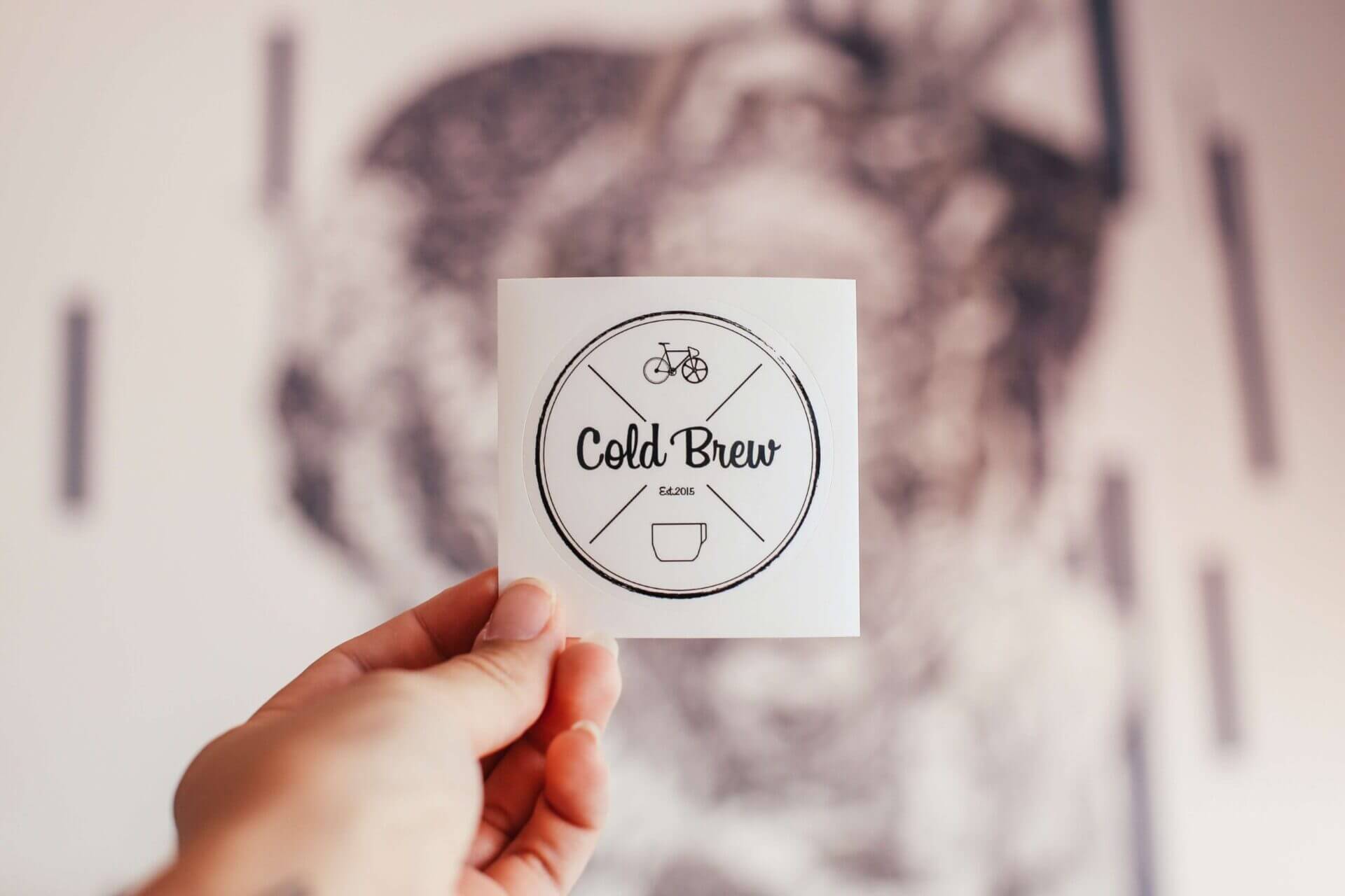
A logo brings recognition and awareness to a business, the face of your business and the first initial impression that potential clients will see. It is your unique identity.
Considerations for a logo design:
1.Who is your target audience?
Who is it we are designing a logo for? (Consider the age, gender, income, employment and lifestyle of the audience you are targeting) by creating a profile of your audience it allows you to build an image of what elements you need to include in your design to insure your audience discovers the meaning and intention of your logo.
For example a logo based on gender would involve elements such as these-
Men- bold, dark, thick lettering with geometric elements (colours: blue, black, grey, green,)
Women- Gentle, smooth, curved elements (colours: pink, white, purple)
This is used to help the audience differentiate what style of business the logo reflects.
2.How you would like you logo/brand to be perceived by others?
What is the key image/message you are trying to communicate?
Is your business new current and needs a fresh professional image, or are you re-branding something with traditional elements.
(Consider logo styles such as: Modern, Grungy, Minimalistic, Colorful, Bold, Elegant, Text heavy etc.)
To have a successful design you must stand out from your competition and reflect your most unique selling points.
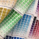
Colours are used in design to convey a message, grabbing the attention of your selected target
audience.
Various colours suggest and portray different meanings and messages as they are used in design to enhance the message being conveyed, so your choices of colour should be chosen carefully based on your target audience. For example the colour blue used in logos would reflect themes such as Good fortune, Communication, and Wisdom.
Blue is often used within corporate companies because of its calming and trusting effects. It is suited to websites selling technology,medication and water based products. This colour wouldn’t be relevant for a business related to children such as a nursery. Yellow would work better.
The power of colour – colour can be particularly persuasive resulting in sales and clients but choosing the wrong colours could result in misinterpretation of your business and its services.
4. Saleability, where will the logo be used?
Is the logo going to be used on stationery sized items and how will the amount of detail used effect this?
A logo should be visible even when reduced down to a smaller size. To avoid your logo looking unclear and fuzzy you will need to consider how much detail is being used, excessive use of detailed imagery will reduce it’s impact.
Remember- using solid flat colours will be best accessible.
- Simplicity – less is more.
- Memorable – unique for easy recognition.
- Longevity– timeless, future proof of new trends.
- Versatile – originality from other business.
- Appropriate – relevant to your business sector.


