A business card acts as a reminder to your contacts of who you are and what company you work for. Your business card should be sharing the information that is most important for people to know about your business.
But a business card can also tell someone how to perceive you and your company.
Does it really matter how the card looks, is it only the details written on it that matter?
Here at Squibble, we believe the design counts as well! A sleek and simple business card that delivers the necessary details with elegance is surely better than a plain card or an over complicated card.
How should it look?
Most business cards are plain with the relevant information and not much else. If you want to be remembered by those you give your business card to then it’s important your card stands out. This can be done in various ways depending on how you want to be portrayed.
You should always check spelling and the spacing of words and logos.
And make sure that the most important information (your contact details and information) is clearly visible.
Make your card stands out
After that it’s up to you how your card looks. You can use images, colours and fonts to differenciate your business card, but make sure they are appropriate to the type of business you’re operating. Here are a few ideas:
Colours
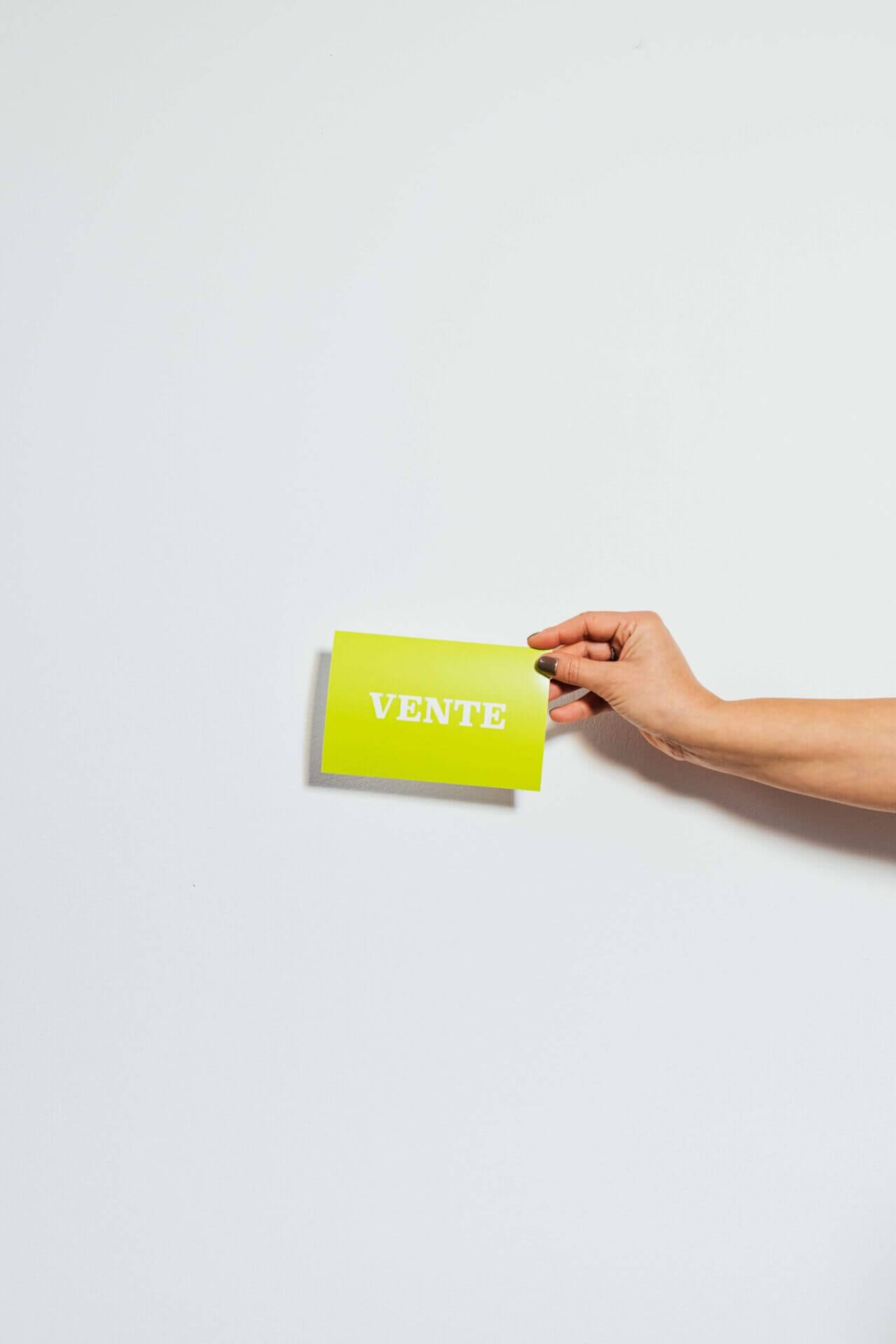
You could have a coloured card, they make much more of an impression than the standard white business card.
Always remember that certain colours evoke emotions or feelings, for example red conveys strength or power and green is more relaxing.
Sleek and simple
An uncomplicated, simple card could also be a great option. Include your relevant details in an elegant font but ignore any loud colours or patterns. Simple but well produced can make as much of an impact as a colourful card. But make sure you don’t take it too far and end up with an empty looking, boring card. Simple but not plain!
Use interesting textures
A thick card or maybe a different shape of card could also be a strong idea. A thick card feels good when you hold it, it isn’t flimsy or easily broken and a shaped card could be a great talking point. But both could cost more, so be careful what materials you use. Also, remember a card may need to be tucked into a pocket or popped into someones wallet, so don’t create awkward designs that will cause annoyance.
Always use the back!
Whatever you have decided to do with the overall presentation of your card, you should always use the back!
If the front of your card is full with contact details and information on you and your company, then add you social media information on the back. Or your website address. Or maybe a quote or your company’s tagline. Even a small map of your office location would be useful and fill the space.
Or, alternatively leave it blank intentionally and add in a personal message to the person you are handing your card over to, this could be the date of your next meeting, your mobile number or another email address. Whatever it is, it would make them more likely to keep it and remember who you were and make them feel a little special.
Feeling adventurous?
Something more technological that you could add to your card is a QR code. This can be linked to your website or social media page and the receiver of the card merely has to scan the code with their smartphone to view the site. It makes the card more interactive and modern.
What is best for me?
Louder, more colourful card may be better for creative companies and sleek, simple but well styled cards better for a more serious or business style company. The QR code is a very technological addition and you should think about whether your contacts will bother using it before adding it.
These are all crucial elements to consider because after an initial introduction with someone, your business card will be a tangible reminder of you. You need to make sure it looks professional and creative and relates to your company.


