We were sitting in the office last week discussing the Boots branding and why it had never been updated. It got me wondering and I wanted to explore its history and evolution.
Boots is one of Britain’s best loved brands. Built on 170 years of heritage, the Boots brand has evolved from a small herbalist store in Nottingham to a household name with flagship stores worldwide.
From herbalism to get-well remedies, Boots was initially positioned as the store which offered traditional medicines at greatly reduced prices. As the brand grew and evolved it eventually started manufacturing their own line of products.
With the growing market, Boots introduced beauty and skincare brands to their product offering including their own brands such as No7 and 17 that catered for a wide range of demographics.
Over the years, people’s ideas about wellness and their relationship with wellness brands have changed, and consumers’ needs have become more demanding. Boots marketing efforts have adapted to these needs with the pressure from new competitors. From discounters to online beauty specialists, Boots has become the home to big brands and a wide service offering.
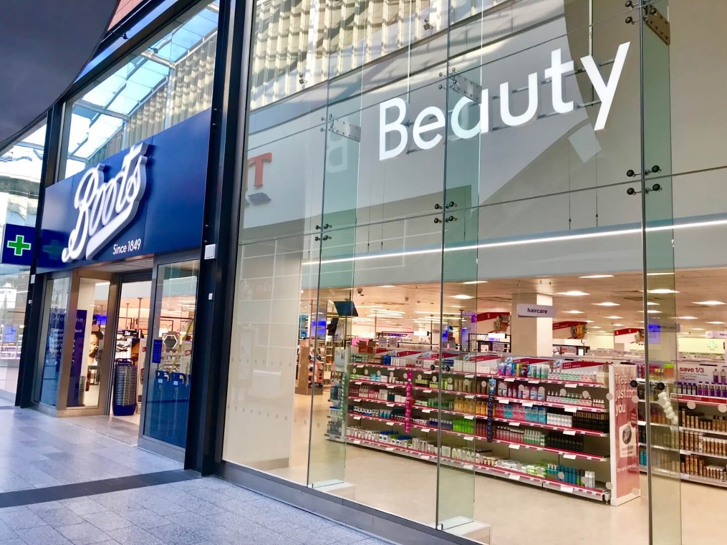
The Boots brand has been known for its striking blue appearance with a Script-type font in the blue lozenge. Over the years, Boots branding, in particular its marketing materials have changed to keep up with design trends and new demographics entering the market, but for some time, Boots remained behind the competitors and 170 years on from when the brand first started, it was starting to struggle. The boots identity hadn’t been reviewed in decades and still closely matched to the original Boots branding from 1849.
Coley Porter Bell, an advertising agency in London, were tasked to review the brand strategy and update the branding for this digital age. Coley Porter Bell had identified that the brand’s purpose still rang true to heart: Our confidence inspires yours – but it had never been truly activated within the branded materials. They unleashed colour and designed a new and emotionally engaging brand identity, flexible enough to shine in the very different arenas of beauty, wellness and pharmacy.
Since the new identity launched in Covent Garden’s Boots Store of the Future, Colley Porter Bell claims that customer satisfaction has improved, and significantly more customers view the brand as ‘modern and up to date’.

But what do we think? The introduction of vibrant, fresh colours embodies the empowerment they bring to individuals, and the clean sans serif typeface helps to modernise the brand and bring it into this decade. The imagery used encapsulates diversity and the modern era with models of all age ranges and ethnic backgrounds that advertise boots products in true light. The identity is appropriate for all demographics and considers the placement in their other reliant departments including pharmacy and wellness.
But one thing hasn’t changed though… the logo. Boots has decades of heritage that has helped to shape the brand as it is today and the logo is not too dissimilar in terms of typeface from the original logo of 1849.
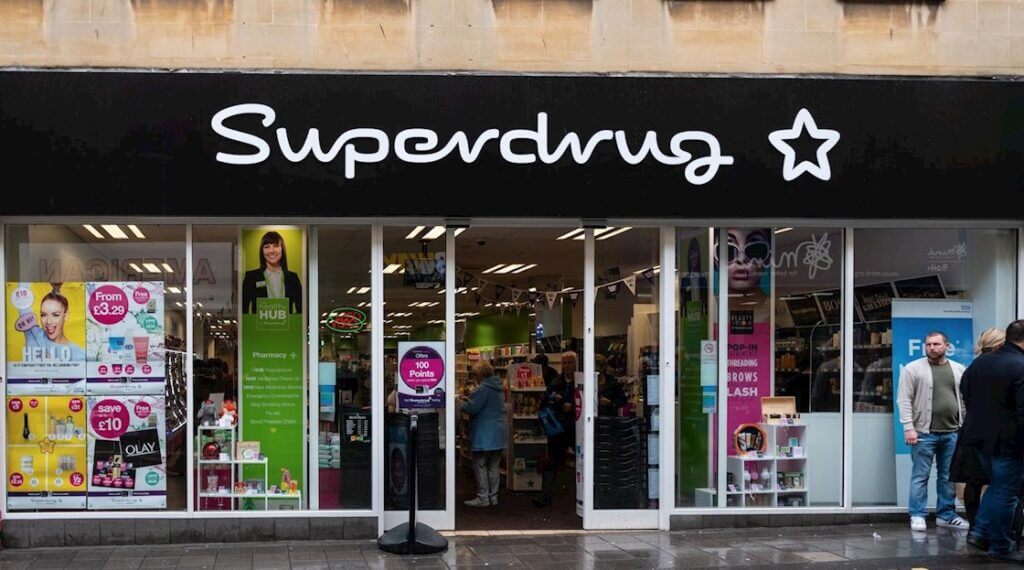
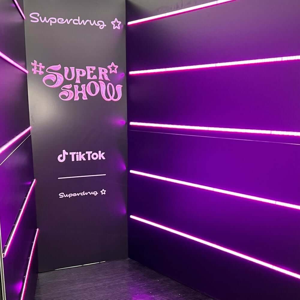
Let’s take a look at Boots rivalling competitor, Superdrug. The second largest UK health and beauty store behind Boots. The brand was developed in 1968 and is recognised for their bold pink and black brand colours. The logo’s typeface showcases the 90s launch of the brand with the serif typeface that is overly relaxed with the ‘handwritten’ design.
Superdrug has created a brand that targets a demographic of 25 to 35 year olds, being predominantly female and is focused on retailing and attracting customers who are more value-orientated with the beauty brands that they house.
In 2010, Superdrug released a marketing campaign called ‘Take another look’, after 10 years since the brand launched. The aim behind the campaign was to encourage customers to visit their stores – seems as though their original marketing efforts weren’t quite having the impact on sales as they had hoped, and who can be surprised with the big blue logo as its daily competition – quite the kick in the teeth if you ask me! Superdrug continued to branch out with their marketing and advertising campaigns and featured in magazines and podcasts and bringing out their own loyalty card (wonder where they got that idea from), but their branding hasn’t evolved with the changing times.
Unlike Boots, Superdrug hasn’t revolutionised their branding, still remains the shocking pink and black across their stores and campaigns which has started to age over the years. With their current demographic and value-focused product range, popular among Boomers, Gen Zers and some Millennials, revolutionising the brand could risk losing their popularity.
It’s like when you always buy the same lipstick, in your favourite colour and then one day you find it’s been discontinued and you have to start all over again. This is the same for the Boots and Superdrug logo – such a drastic change could leave customers confused and almost forgotten about especially if they weren’t considered in the process.
And what about new customers? What about the uprising Boomers and Gen Z who are heavily concerned about what foundation Kim Kardashian is wearing, or how to cut a crease (we still don’t know what sorcery is used for this). In a visual world, particularly with the influence of social media, there is the demographic of customers who care deeply about how things look and what they are associated with.
With TikTok becoming the powerbank to cosmetic purchasing decisions, ‘influencers’ really do influence what we buy and the products we purchase and the beauty industry has benefited from the increasing popularity of social channels. Gen Z now accounts for a staggering 40% of consumers worldwide, wielding a mighty global spending power of $200bn a year, according to World Finance.
And with many Gen Zers still living at home, they also influence what their parents are spending their money on, I think the phrase is “but muuuuuummmm”. Brands are now clocking the power of social media with influencers sponsored to advertise cosmetic brands and using the “Tiktok made me buy it” slogan in stores.
So does branding really make a difference to a consumer’s purchasing decision or are there other contributing factors? Are digital marketing and branded advertising more of an influence in this case?
When a well-established company such as Boots has invested in long term brand building and having built up huge reserves of brand equity and value a complete overhaul could cause more damage than good.
There have been minor changes where the colours have been altered slightly but on the whole it has remained largely unchanged. Boots, to their credit, haven’t been swayed to “modernise” but have worked hard to support their brand evolution with targeted campaigns designed to suit the generational shifts.
For brands such as Boots and Superdrug, I could also argue that the logo of the store doesn’t actually matter. It’s really the brands they stock that affect consumer purchasing trends.