
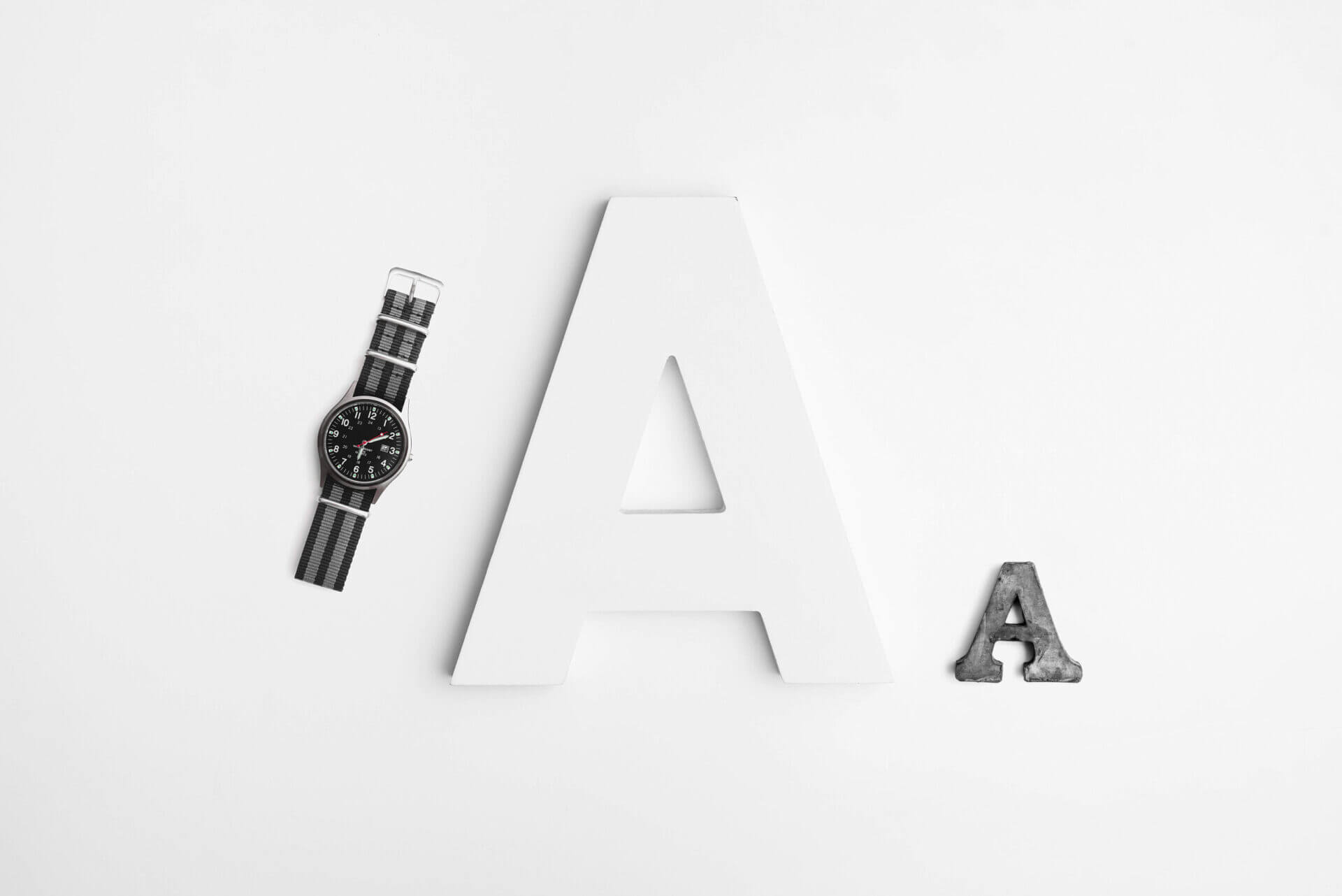
I often think that Typography is overlooked in print and digital artwork. For me it is the je ne sais quoi! It will either make or break the image, more often or not probably breaking it.
I believe that some people don’t think of typography as an important part of designing or an art form. “It’s just a font, we have loads, and they look so similar!” (I hear you gasp designers) At the risk of boring those said believers I will ask one question: Do you realise how much history is behind a font, any font?
Birmingham based Graphic Design company Squibble explain how important Typography is. Typography is the art and technique of coordinating, modifying and designing type. It can be done using illustrative design techniques.
So in case you’re wondering this is what needs to be considered when designing new fonts:
“The arrangement of type involves the selection of typefaces, point size, line length, leading (line spacing), adjusting the spaces between groups of letters (tracking) and adjusting the space between pairs of letters (kerning).[2]”
Working in a digital age means that it is now more accessible to design your own type using graphic design packages. As mentioned in one of my previous posts “Why is logo Design so important?” I used a font called Geosans Light and modified it using Adobe Illustrator to create something original.
Here is the original font followed by my moderations of Birmingham based design company Kimberley-Jane: Designs logo.
![]()
Typography forms an integral part of graphic design when being used for something like poster design. However, this is not going to be my main focus for this blog because whilst writing it I was inspired to continue with a project I started many years ago. I believe this will give readers something more interesting than another history lesson.
I want to introduce the way I use lettering…
I use lettering to create artwork – where the curl of a letter forms part of the overall image. Where the lettering becomes my brush stroke.
These are the original designs which got me started on using lettering. I enjoyed working with shapes that changed if you rotated part of the image and repeated it. Every new move opened up a surprise shape or pattern.

However, that was 4 years ago as part of my uni degree. I’ve now picked it back up again and here are the first two from ‘K-Series’ which I will continue to develop building in full words and less obvious lettering. I also want to play around with different layouts to build a series that can sit side by side without looking too repetitive.

Inspiration can come from the strangest of things. I enjoy working in an abstract way and the textures and imagery in these two images came from photographing my beaded headbands!
Whilst writing this blog I read an article in Look magazine which shows how on trend my work is: