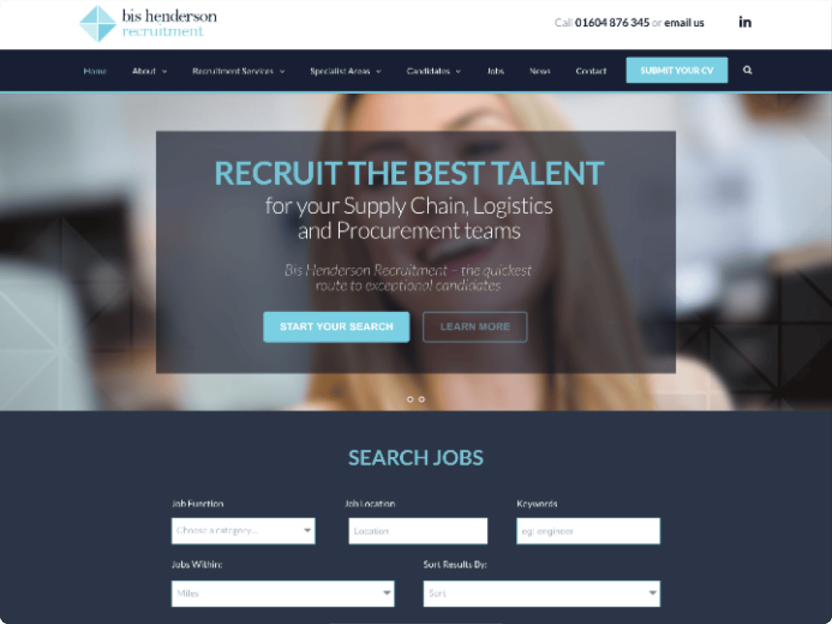
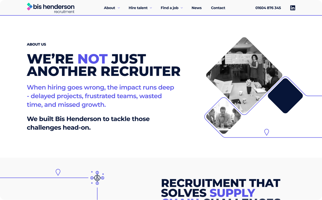
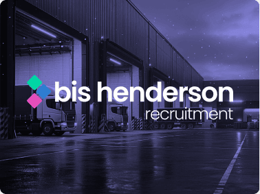
Turning a tired, confusing website into a confident digital experience
Bis Henderson came to us with a website that no longer reflected who they were. The design felt flat and dated, the navigation was cluttered and the content lacked a clear story. As a result, users were struggling to understand their offer and key enquiries were being lost.
Results
20% Decrease
In Bounce Rate
30% Increase
In Engagement
22% Increase
in Traffic
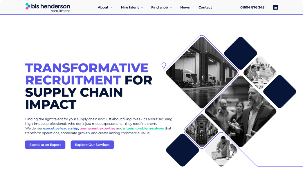
Evolving the brand to tell a stronger story
Bis Henderson did not initially plan a rebrand, but their existing identity was too limited and old-fashioned to support the modern website they needed. The visuals lacked personality, the colour palette felt flat and there were not enough usable assets to tell their story with confidence.
We refreshed the brand to reflect who they had become: a trusted, people-focused business built on momentum and growth. The new identity introduced a brighter palette of pink, blue and green to represent the three divisions, along with a modern logo, flexible icons and graphic assets that conveyed movement and progression.
This stronger foundation allowed the website to come to life. Instead of feeling corporate and dated, Bis Henderson now had a brand that was clearer, more engaging and more reflective of the care and professionalism clients expect.
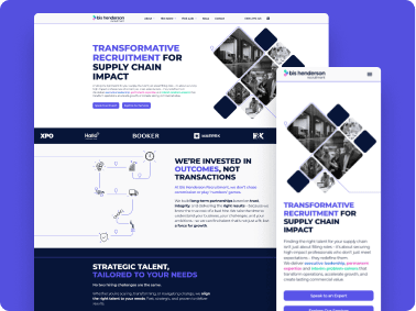
Website
BeforeAfter
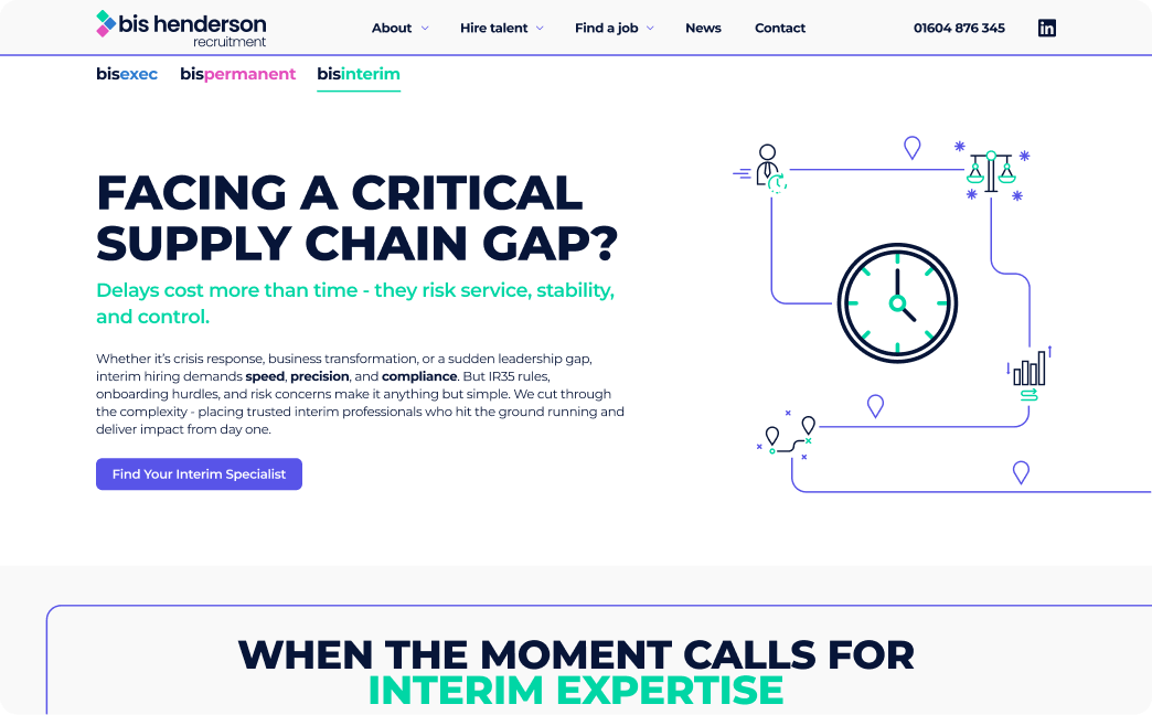
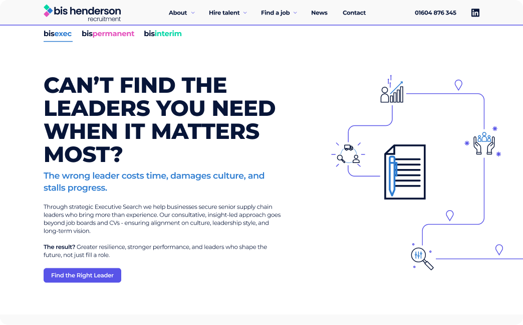
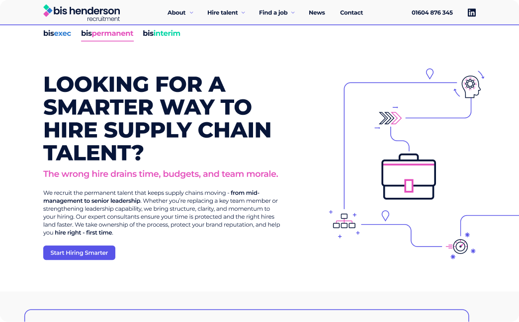
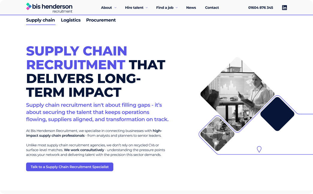
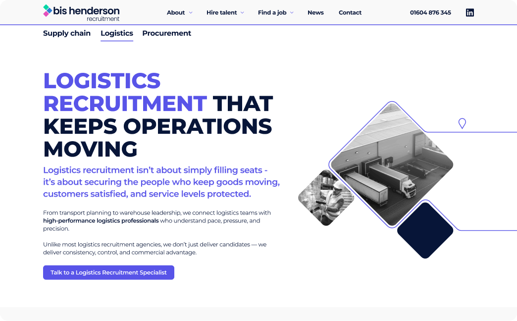
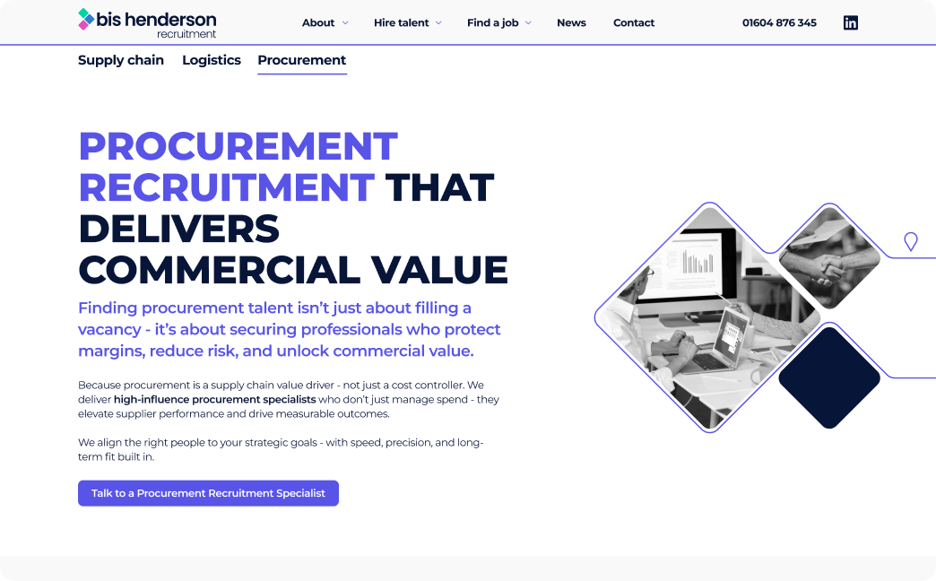
Bringing clarity to 3 very different audiences
The existing messaging was broad and polite, but it didn’t reflect the real conversations happening with clients. Different audiences were being spoken to in the same way, which made it harder for people to quickly recognise whether the service was right for them.
What we did We ran a one-day strategy workshop to understand who the business was really speaking to and what each audience needed to hear. This allowed us to define three clear audience groups and the messages that would resonate with each. We rewrote and reorganised the messaging so each audience could immediately see themselves, understand the value, and move forward with confidence.
The shift Messaging became clearer, more direct and problem-led.Visitors now feel understood faster, and the website makes it easier to take the next step.
A clearer, more confident website
The new website delivers clearer journeys, stronger messaging and a cleaner design. Here are the key improvements.
Stronger first impression Replaced a dated, generic layout with a modern design that feels confident and professional. Updated the visual language to match the refreshed brand and show more personality.
Better storytelling Introduced messaging that speaks directly to client needs rather than generic statements. Highlighted outcomes, trust and long-term relationships instead of transactional language.
Clearer structure Simplified the navigation so users could find the right service without confusion. Created three focused pathways to guide different audiences quickly.
More engaging content Introduced icons, illustrations and visual assets so pages felt more human and less corporate. Built structured layouts that could expand as new case studies, services and content were added.
Feeling like your messaging is holding you back?
When strategy moves on but the site doesn’t, growth slows and trust erodes.
Struggling to get buy-in? The No-Brainer Business Case helps you turn that frustration into a clear, credible case decision-makers can’t ignore — so you can secure budget and move forward with confidence.
As a trusted creative design agency, we deliver measurable results for our clients. Here’s how we’ve transformed businesses with bold, strategic solutions.