Home » Case Studies » Woodshires

A Bold Look for Tax Consultants.
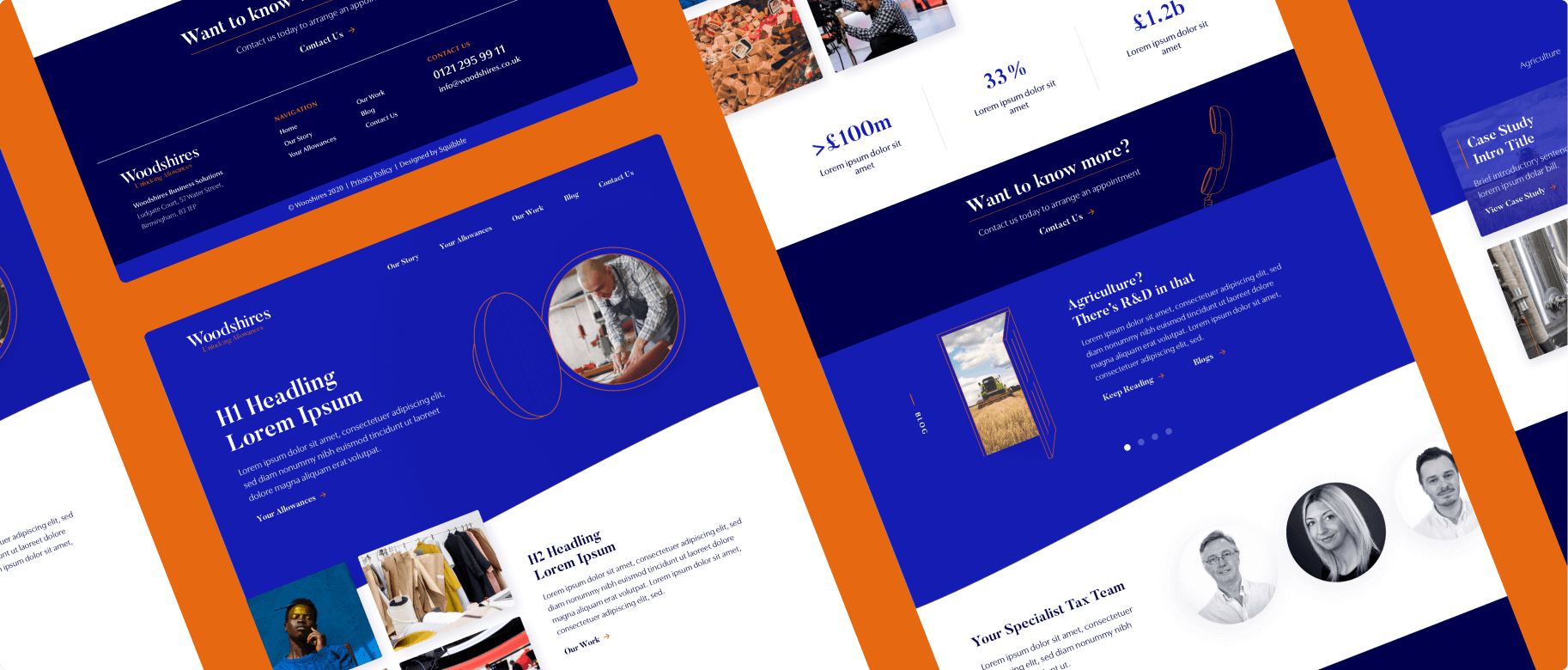
The world of accountancy branding has a common aesthetic. It tends to lean toward the grey and self-serious end of the spectrum. And yet, the teams at these companies are often full of personality. That’s what we found when working with the senior team at Woodshires. So, we put that personality on the page.

- UX/UI, Web Design
- B2B
- CEO
- 2 Months Turnaround

The Wishlist
Each of our clients is unique, and so are their needs. Let's take a closer look at how we helped address specific project goals.
Bold Web Design
With a world full of numbers, we introduced colour and creative assets to what was considered a boring website design and really brought it to life.
Easy to Update Blog Templates
As avid blog writers, Woodshires wanted the ability to easily add blog content to the website. So that's exactly what we gave them with their custom WordPress site.
Drag and Drop Assets
Giving the brand personality, we created some hand-drawn assets for them to use across their marketing materials - you know, to show off a little!


Delivering Results
Discover how our tailored solutions turned client aspirations into reality.
Demonstrating Expertise
The team works with clients across a huge number of sectors, helping them to efficiently manage their tax. This range of expertise had to be captured on the website. Our solution? A custom-built case study section to showcase projects. And they have adaptable CTAs that can be super targeted – an effective tool for turning website visitors into clients.
Unlocking a World of Colour
If you're going to do something completely new, it should feel right. Looking at Woodshires existing branding, we found a bold shade of blue nestled in their logo. It was a perfect foundation for the new website. We worked closely with the team to draw out the colour and find the balance between professional and bold.
Handrawn Personality
To take the Woodshires brand further than stock imagery, we illustrated a range of images that could be used to add personality and authenticity to their visual identity.
“With continual growth year on year we needed a look and feel that better represented us. Squibble's creative process enabled us to achieve just that.”

Stu Wood
Founder - Woodshires
Tired of Going it
Alone?
Book a Discovery Call: Let’s have a chat and navigate your marketing challenges together.

Questions about Integration?
Send us an Email: Discuss CRM choices, digital shifts, or refine your strategy. We’ve got your back.

Ready to Boost your Marketing Strategy?
Sign up for THRIVE: Get curated insights tailored for marketers. Stay ahead and always inspired.

