Designing a website that connects with people’s lives
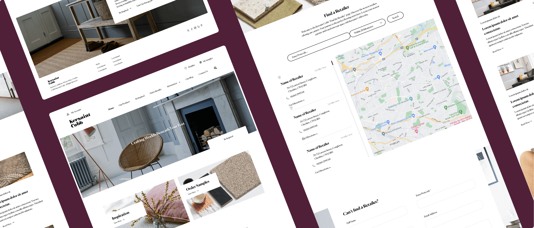
Kersaint Cobb came to us looking to replace their existing content management system with a more user friendly solution and revamp their location page to provide a more functional and customer-centric user experience, setting a new standard for their online presence.
The team at Squibble has been instrumental in transitioning several of our websites, helping to reposition them with a stronger focus on the customer.
Their efforts have significantly improved the user experience, making our sites more intuitive and engaging for visitors. At the same time, they’ve ensured that the marketing team has complete control over the content and functionality, enabling us to be more agile and responsive to business needs.
Squibble’s expertise and attention to detail have been key to achieving a balance between user-centric design and operational flexibility.
Lucy Whalley – HFD Tamworth
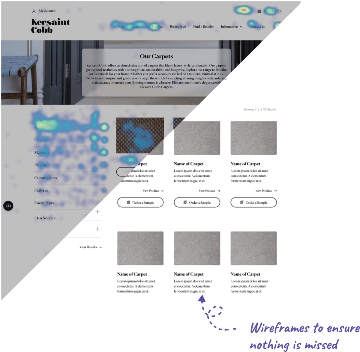
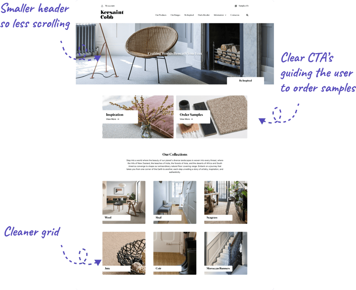
1. Analysing where users click
We analysed where users clicked within the filtering section of the e-commerce website to test design and UX improvements. This allowed us to refine the filtering experience, making it more intuitive and user-friendly.
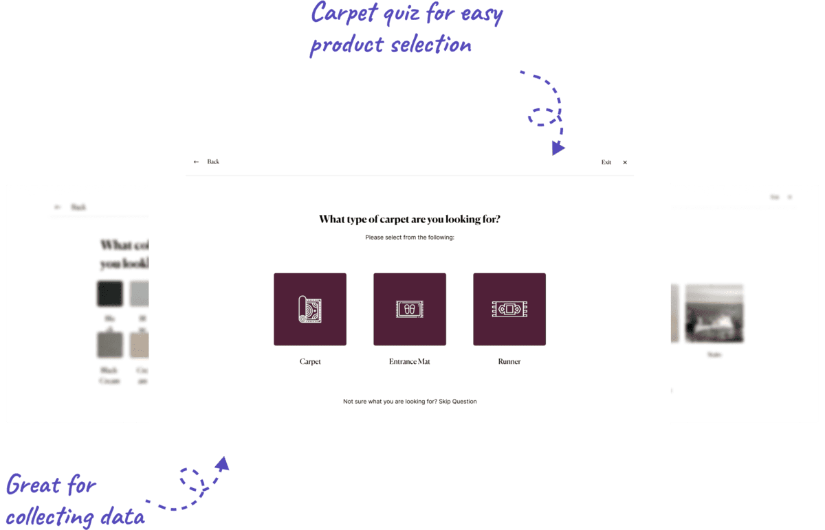
2. Help users to make a choice
To help users make a choice, we developed a carpet quiz after discovering that many felt overwhelmed by the options. The quiz guides them through a few simple questions, providing tailored recommendations to simplify their decision-making process.
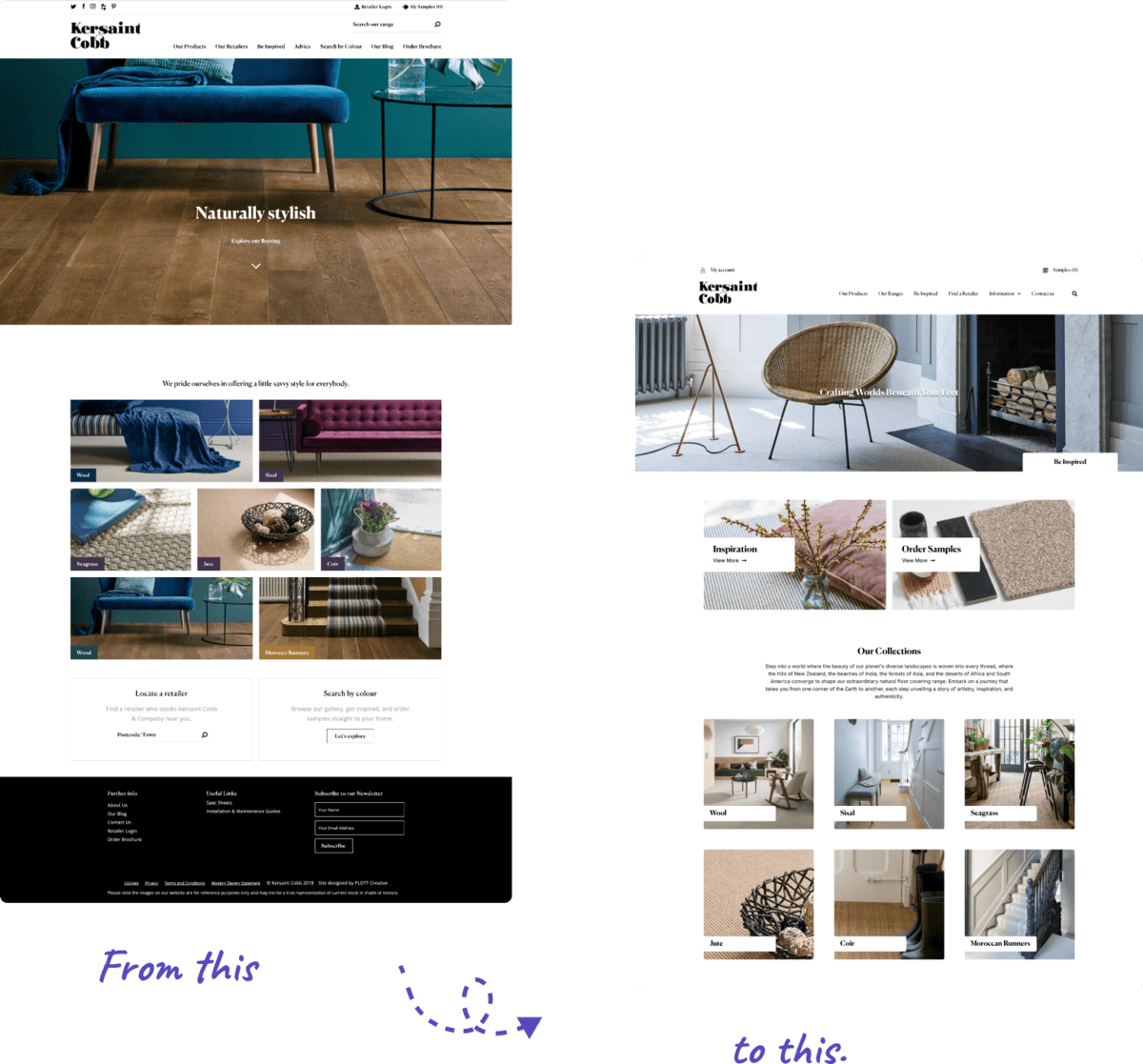
3. Better UX to increase sample orders
Our main goal was to streamline the user experience by reducing the number of clicks and making it easier for customers to find products, even within vast product ranges offering thousands of choices.
4. The solution
The solution was guided by detailed analysis of user clicks, which informed key design decisions. By streamlining the layout and reducing unnecessary scrolling, we improved usability and navigation. Clear pathways were created to guide users through the site more intuitively, leading to a smoother, more efficient user experience that aligned with their needs and behaviours.
Feeling like your messaging is holding you back?
If you’ve just read this and thought: “Our site doesn’t say that” we can fix it.
Book a free 60-minute Strategy Call – we’ll pinpoint where your site’s losing momentum and how to fix it. Book a Strategy Call →
Not quite ready for a full strategy call?
If you’re still working on internal buy-in, the No-Brainer Business Case can help you build a solid argument. Get Buy-In with Our Pitch Deck →
The breakdown gave us so much clarity moving forward, and the format was incredibly usable.