
A contact form can seem a simple thing: a means of enabling users to send to an organisation a query or question. The truth, however, is that they are more complex than that – if their full potential is to be realised. You need to get the user experience – or UX – right.
Contact forms require thought – and they demand good UX design. A poorly considered contact form will not be user-friendly, and that will mean that you will gather much less data than you might otherwise.
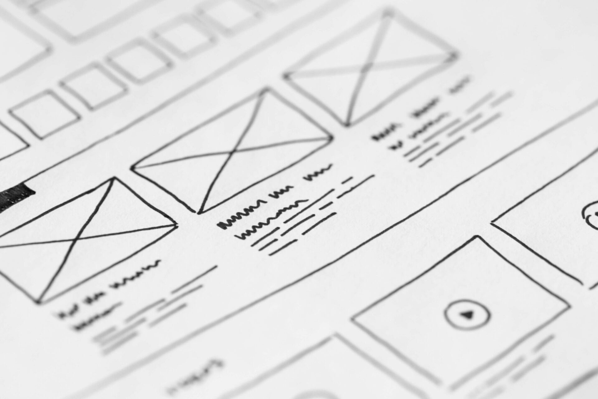
The goal of any business is to convert leads through engagement. A contact form is a key channel through which to achieve this. The critical element of any form is its fields: what they ask for, how many there are, and how they are arranged.

For example: use a single column format. Why? Because studies show that users’ eyes track more easily across a single space than a split-column area. It follows, too, then, that alignment should be vertical: one field followed by another directly below it.
If there are a lot of fields, try arranging them by purpose: “Your Contact Information” and “Your Delivery Details”, for example. Again, this is about helping users navigate the form more easily – to reduce the barriers to comprehension and therefore to engagement.
Likewise, each field should be clearly labelled. Placing those labels (“Name”, “E-mail address”, “Phone number” etc.) above a field is preferred by Google: it renders very well on mobile screens and makes flow very clear; the obvious alternative is left-justified labels and these can be great where vertical space is at a premium. But take care to ensure that left-justified labels still work on those mobile screens!
Increasingly, designers are including labels and help tips in the fields themselves – though always make sure this text disappears when a user clicks the field and begins to type! The danger here is that, in more complicated forms, a user might forget what each field is for once the label has disappeared.
These kinds of consideration matter: good UX is about constantly cueing the user as to what they can – and even should – do next. Emphasising an active field with a darker border colour is a common means of situating a user within a form; so are clear buttons – ones that make obvious the action that will occur once they are clicked (“Send”, “Submit”, “Next”).
Making forms easier in this way will increase your conversions. Leave buttons faded until all mandatory fields are filled; in complex forms, ensure the sequence of actions is clear (adding a promotion code before proceeding to check-out, for example); offer autofill options for users, so that spend less time in each field.
Smart visual choices can also contribute to a quality experience: shorter input boxes for phone numbers than names, for example, subconsciously remind the user what length of response is required. Similarly, avoiding CAPS LOCK in your labels will render the form a calmer experience. Where the options are fewer than five, radio buttons are a smatter choice than drop-down lists. And so on.
Finally, where forms involve a log-in, make life easy for a user: allow them to log-in via their social account, or to check their password by rendering it visible; alert them if the dreaded CAPS LOCK is on. Don’t let them leave at the last moment!
In conclusion, contact forms are not simple. That’s because no UX question is easy – all issues of design include quite fine judgement calls, and all rely on a knowledge of how websites – and users – work.
Don’t simply bung a form on your site – instead, think about how a user will experience it, and adapt accordingly. That’s how UX in contact forms will turn leads into conversions.